|
Socio-Economic Disruptions and Atmospheric CO2 Concentrations October, 2023 (with note dated June,7 2024) posted on the web at: http://tomsager.org/Socio-Economic-Disruptions-And-CO2-Concentrations.html Affiliation: Missouri University of Science and Technology (emeritus) email: yushasager@yahoo.com website: tomsager.org Abstract: Atmospheric CO2 concentrations typically rise between November and April inclusive, due to Northern Hemisphere trees entering dormancy and sequestering little CO2. However, during three years: 2008, 2020 and 2022, atmospheric CO2 concentrations inexplicably fell during the February/March period. These were also the years of the beginning of what may be the three greatest global socio-economic disruptions of the last half century: the 2008 global economic meltdown, the COVID-19 pandemic and the Russo-Ukrainian War. Statistically, these decreases in atmospheric CO2 concentrations are highly unlikely to lie within the realm of natural variation. For want of any other reasonable explanation, the author suspects a relationship between observed decreases in atmospheric CO2 concentrations and global socio-economic disruptions. An understanding of the physical and chemical processes at work here might lead to better strategies for increasing the flow of carbon from the atmosphere into carbon sinks such as the ocean, thereby reducing global warming. Acknowledgment: I wish to thank the Earth System Research Laboratories (ESRL) of the National Oceanic and Atmospheric Administration (NOAA) of the United States of America for data going back to 1975 on average daily atmospheric concentrations of carbon dioxide at Mauna Loa, without which this article (clearly) could never have been written. Needless to say, any errors or misrepresentations in this article are mine and mine alone. June 7, 2024 Note: Using data downloaded on June 7, 2024, the X-value for 2024 computes to 0.63. 2024 does not appear to distinguish itself according to the criteria of this article: neither in atmospheric concentrations of CO2 in the atmosphere nor economic disruptions on the order of those occuring in 2008, 2020 or 2022. It is my intention at some future date to merge data from 2024 and perhaps subsequent years into this article. Introduction: This article is an update and expansion of the article, “Some Indications That COVID-19 May Have Affected Atmospheric CO2 Concentrations in February and March, 2020,” written in the Spring of 2020. Having noted an unexpected decrease in atmospheric CO2 concentrations in February/March 2020 and having read articles such as “Can we see a change in the CO2 record because of COVID-19?” claiming that COVID-19 could not possibly be the cause of this decrease, I resolved to look into the matter. I looked at daily averages for atmospheric CO2 concentrations going back to 1988 and found that a similar, although far more pronounced, decrease in CO2 levels occurred in 2008, the year of the great global socio-economic meltdown. No other year experienced such a pronounced February/March decrease. I also found that subsequent to the dip in CO2 levels, the atmosphere quickly recovered in April. I conjectured that this might be due to the atmosphere drawing CO2 out of carbon sinks, such as our oceans; or, it might be due to polluters finding ways to pollute in spite of the global disruptions of these two years; or both. The 2020 article was the result. There have been two new developments since then, which are discussed below: 1. ESRL has revised its data according to the WMO X2019 scale. Only minor differences in the results from the Spring 2020 article were found.And here are three enhancements to the 2020 article included herein: 1. The analysis in this article extends back to February/March 1975, the first year for which data on atmospheric CO2 concentrations at Mauna Loa are available, and forward to 2023. The data used in this article were downloaded on Sept. 23, 2023 from this file of daily averages at Mauna Loa.Northern Hemisphere Winter and early Spring is typically a time of increase in atmospheric CO2 concentrations. Trees and other vegetation enter a dormant state in which they absorb little carbon dioxide, removing an important carbon sink. Thus, when we see a decrease in atmospheric CO2 during this period, it behooves us to search for a cause. In February and March of 2008, 2020 and 2022, we saw a significant decrease in atmospheric CO2 concentrations, to a far greater extent than in any other year dating back to 1975. These years marked the beginning of what were perhaps the three greatest economic disruptions in recent times. In late 2007, as a result of large scale speculation and corruption, global markets started a precipitous decline which continued for over one year. In January, 2020 as a result of the COVID-19 pandemic, China, currently the world's largest producer of CO2 emissions, shut down much of its industry and global markets soon reacted to the pandemic with another precipitous fall. February, 2022 marked the start of the current active phase of the Russo-Ukrainian War which continues today. Could these economic disruptions and the reductions in atmospheric CO2 be related? Perhaps. This article attempts to show that statistically natural variation is highly unlikely to be responsible for the observed decrease in atmospheric CO2 concentrations during these three years. The probability of these decreases falling within the range of natural variability is likely under one in three million. Indeed, for want of any other reasonable explanation, one must conclude that with a high probability there is a relationship between the socio-economic disruptions of these three years and the unexpected February/March decrease in atmospheric CO2 concentrations. Methodology: The starting point in this research was ESRL's file of daily averages for CO2 concentrations in the atmosphere as measured at Mauna Loa. First, some missing data points, which might have skewed previous attempts, were filled in through rough interpolation. Where there was at least one valid daily average among the four preceding days on file and at least one valid daily average among the four subsequent days on file, standard linear regression was used to produce an estimated daily average. Data for days which did not satisfy this criteria were left missing. The differences between all consecutive non-overlapping 30-day averages were computed by averaging the difference between days that lay exactly 30 days apart. Days that lay exactly 30 days before or after a missing datum were removed in order to minimize the possibility of skewing results through missing data. To each year, we assign the minimum of all such averages for 60-day periods ending within the range 29 Jan. through 31 March. More precisely: Let Wy be the set of all days between 1 December (year y-1) and 31 March (year y) inclusive. We call Wy the window of interest for year y. Thus, we limit our attention to a period during which atmospheric CO2 concentrations typically rise. Let Zi be the average for day i, either from the ESRL file or as interpolated above. Let Valid(Zi) iff Zi is assigned a value above. ∀ ranges [i-59..i] ⊂ Wy, for some year y, let Yi = (Avg(Zj − Zj-30, such that Valid(Zj) and Valid(Zj-30), i-29 ≤ j ≤ i). If we let A be the range [i-59..i], this is equivalent to subtracting the average of the first 30 days in A from the average of the final 30 days in A after removing all Zi from the first 30 days iff ~Valid(Zi+30) and removing all Zi from the final 30 days in A iff ~Valid(Zi-30) By taking 30-day differences before averaging we minimize the probability of skewing the result due to missing data. Now let: Complete(Yi) iff Yi averages all 30 valid differences; Robust(Yi) iff Yi averages at least 28 valid differences; Acceptable(Yi) iff Yi averages at least 15 valid differences; and Nonempty(Yi) iff Yi averages at least 1 valid difference. Next we let Xy = Min(Yi), such that the range [i-59..i] ⊂ Wy. In this way, we limit our analysis to the 1 December through 31 March period during which CO2 concentrations typically rise. By using 60-day ranges, we winnow out unwanted short term variations. Sometimes we say the X-value for year y instead of Xy for convenience. Further: Let Robust(Xy) iff Robust(Yi), ∀ ranges [i-59..i] ⊂ Wy. Then we compute the mean and standard deviation ∀ years, y, such that Robust(Xy). Here we ignore years with too many consecutive missing data points. The results are given in Table 1, below. Years, for which ~Robust(Xy), are colored blue in the table. Here we relax the condition: ∀ i, Robust(Yi) to ∀ i Acceptable(Yi). And in the case of 1976, we relax the condition even further to Nonempty(Yi). The years, for which ~Robust(Xy), do not appear to distinguish themselves particularly according to the criteria of this article. Below the Results section, Figure 1 describes this methodology graphically with an example. 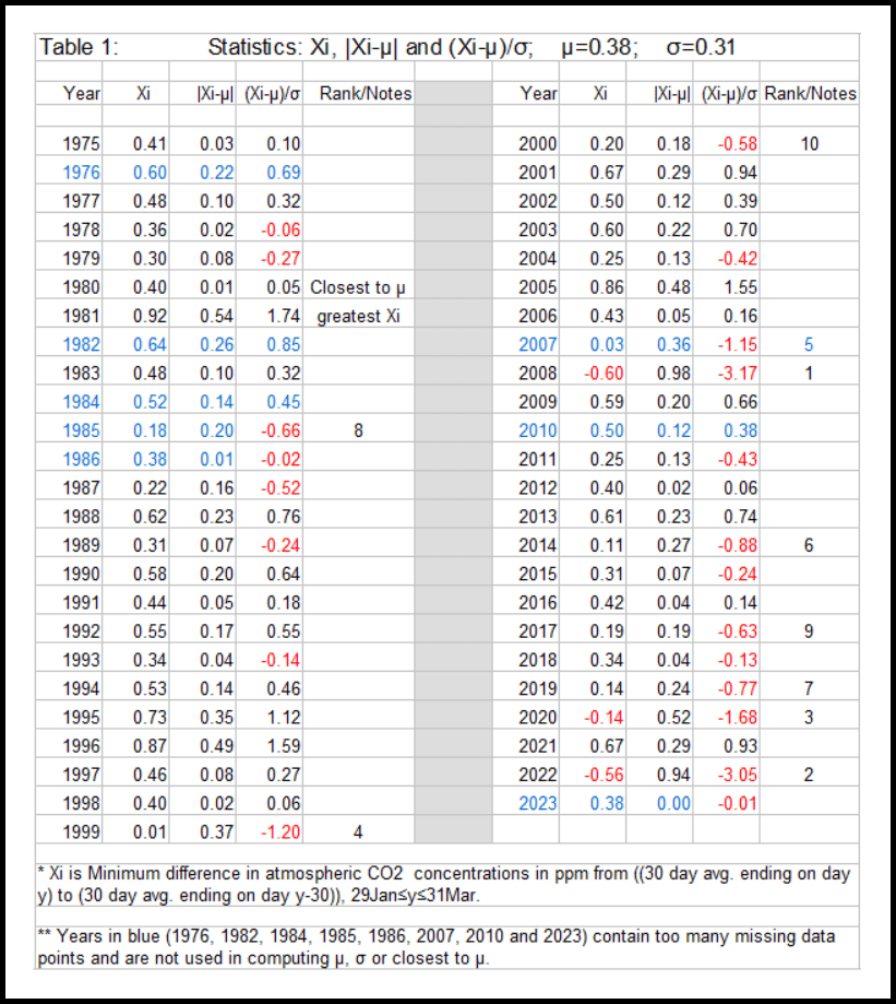
Results Of the 49 years analyzed (1975-2023): 41 years are Robust. 1976, 1982, 1984, 1985, 1986, 2007, 2010 and 2023 fail the robustness test because of too many missing data points in the wrong places. Three years have an X-value less than zero. This means there is at least one 60-day period, ending between 29 Jan. and 31 March for which the average over the first 30 days exceeds the average over the last 30 days, averages computed according to the methodology section above. These three years are 2008, 2022 and 2020, with X-values of −0.60, −0.56 and −0.14 respectively. These years marked the beginning of what were perhaps the three greatest socio-economic disruptions in recent times. In late 2007, as a result of large scale speculation and corruption, global markets started a precipitous decline which continued for over one year. In January, 2020, as a result of the COVID-19 pandemic, China, the world's largest producer of CO2 emissions, shut down much of its industry and global markets soon reacted to the pandemic with another precipitous fall. February, 2022 marked the start of the active phase of the Russo-Ukrainian War which continues today. The mean, μ, and standard deviation, σ, for the X-values of the 41 Robust years are 0.38 and 0.31 respectively. The three years with negative X-values lie −3.17σ , −3.05σ and −1.68σ below μ. Assuming a normal distribution the chances of three random points lying this far or farther below the mean are less than one in three million. Thus, it beggars belief that these unexpected decreases in CO2 concentrations are entirely due to natural variations and the concurrent socio-economic disruptions have no relation to it. 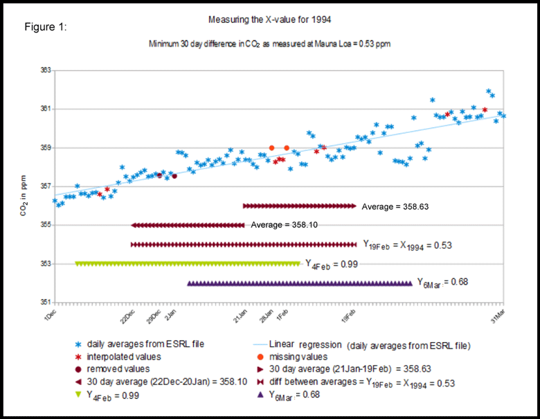
An example: computing X1994 1. Plot the average daily atmospheric CO2 concentration for all days within the window of interest, 1 December 1993 through 31 March 1994 inclusive from the ESRL file. (see Figure 1 above, light blue stars). 2. Using the algorithm described in the methodology section above, compute interpolated values where possible, (red stars). 3. Mark days for which the above algorithm fails as missing, (red circles). 4. For each 60-day period within The window of interest do 4a though 4c: (In the example in Figure 1 above, we choose the period 22 December through 19 February, [purple butterflies]). 4a. For each missing datum in the 60-day period, remove the datum that lies 30-days before or after the missing datum, (purple circles).5. Take the minimum Yi over all 60-day periods within the window of interest. Call this number Xyear, in our example, X1994 = Y19Feb = 0.53. This is the minimum 30-day change in CO2 concentrations over all 60-day periods within the window of interest. Besides Y19Feb, Y4Feb = 0.99 and Y6Mar = 0.68 are also shown in Figure 1 above as green downward-facing triangles and purple upward-facing triangles respectively. Providing Context Seven year-long graphs of 30-day running averages of atmospheric CO2 concentrations are provided in Figures 2 through 8 below. They are: Years 2008, 2020 and 2022 were chosen as the only three years with negative X-values. These three years may also have witnessed the beginning of the three greatest socio-economic disruptions of the last half century: the 2008 global economic meltdown, the COVID-19 pandemic and the current active phase of the Russo-Ukrainian War. All three years witnessed a recovery in atmospheric CO2 concentrations after an unexpected February/March decrease. Two possible conjectures for this recovery are offered in the Discussion and Conclusion Section below. Year 1999 was included because it had the lowest positive X-value. 1999 marks the “Y2K craze,” which may have caused a certain amount of disruption, although not on the order of the previous three years selected. Nor did 1999 witness a decrease in atmospheric CO2 concentrations on the order of the previous three years selected. 2019 was included for consistency with the 2020 paper on this subject. The graph for year 2019 appears somewhat anomalous. 1980 was the year whose X-value lies closest to the mean, μ=0.38, excluding 2023 which was not Robust. 1981 had the highest X-value, 0.92. Recall that the X-value is the minimum change in average atmospheric CO2 concentrations between two consecutive non-overlapping 30-day periods lying within the 1 December through 31 March window of interest. In these graphs, the dark blue area marks the area where atmospheric CO2 concentrations might have been higher in a more “normal” year. The red line is a curve fitted to the first datum, 30 November, the maximum point of the graph and, in most cases, the start and end points of the unexpected decrease in CO2 concentrations. Interestingly, after reaching their Spring maximum, none of these graphs exhibit features that appear out of the ordinary. Also of interest is that the decrease in atmospheric CO2 concentrations happened only at the beginning of relatively long socio-economic disruptions. Although these economic disruptions continued into the following years, 2009, 2023 and 2021 did not exhibit a noticeable February/March decrease in atmospheric CO2 concentrations. The seven graphs below were drawn using the following methodology: Let A be the set of all 30-day periods lying between 1 through 30 November of the preceding year and 2 through 31 December of the year to be graphed.Seven year-long graphs of 30-day running averages of atmospheric CO2 concentrations 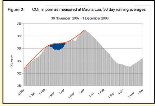
X2008 exhibits the largest negative distance from the mean. The average atmospheric CO2 concentration for the 30-days ending on 16 March is 0.60 ppm less than the average for the 30-days ending on 15 Feb. The graph shows a definite depression in February/March as atmospheric CO2 concentrations decreased. Atmospheric CO2 concentrations recovered reaching a 30-day maximum of 389.02 ppm on 5 June. 2008 was the year of the greatest global economic meltdown of the past half century, caused to a large extent by rampant corruption and speculation. 
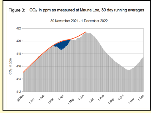
X2022 exhibits the second largest negative distance from the mean. The average atmospheric CO2 concentration for the 30-days ending on 29 March is 0.56 ppm less than the average for the 30-days ending on 27 Feb. The graph shows a definite depression beginning on March 1 and extending into early April as atmospheric CO2 concentrations decreased and then began to recover. Atmospheric CO2 concentrations reached a 30-day maximum of 421.40 ppm on 9 June. 24 February 2022 marked the beginning of the current active phase of the Russo-Ukrainian War. Interestingly, 30-day average concentrations began to fall less than a week later. I can't help wondering whether this might be more than a coincidence. 
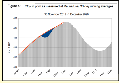
X2020 exhibits the third largest negative distance from the mean. The average atmospheric CO2 concentration for the 30-days ending on 14 March is 0.14 ppm less than the average for the 30-days ending on 13 Feb. The graph shows a definite depression between 25 February and 26 March as atmospheric CO2 concentrations decreased and then began to recover. The depression is considerably smaller than those in 2008 and 2022. Atmospheric CO2 concentrations reached a 30-day maximum of 417.32 ppm on 28 May. The COVID-19 pandemic began in late 2019, but didn't begin to cause economic disruptions until 2020. In early 2020, China, currently the world's largest producer of greenhouse emissions by far, shut down much of its industry causing a global economic downturn. 
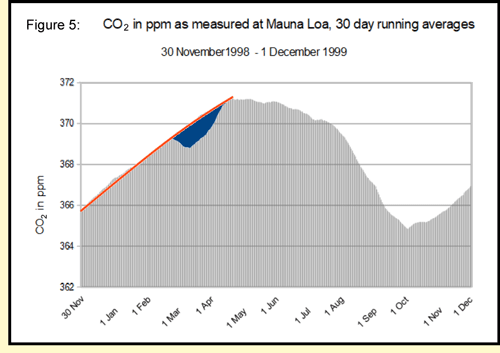
X1999 exhibits the fourth largest negative distance from the mean. The average atmospheric CO2 concentration for the 30-days ending on 11 March remains 0.01 ppm more than the average for the 30-days ending on 9 Feb. The graph shows a definite depression between 23 February and 20 March as atmospheric CO2 concentrations decreased and then began to recover. The depression is considerably smaller than those in 2008, 2022 and 2020. The depression is small enough that the difference between every pair of consecutive non-overlapping 30-day periods remains positive, albeit in this case very close to zero. Atmospheric CO2 concentrations reached a 30-day maximum of 371.25 ppm on 20 April. Whereas the other six years graphed here reached there maximum value between 28 May and 10 June, the maximum average over all 30-day periods in 1999 occurred over a month earlier. I can't think of anything particularly disruptive in 1999, The closest I can come is the “Y2K craze,” which certainly doesn't rise to the level of disruptiveness of war, pestilence or global economic meltdown. 
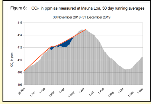
X2019 is included for consistency with the 2020 paper on this subject. At the time it appeared particularly anomalous to me with a very short February/March depression and a much longer but less pronounced depression in March/April. Today it does not appear so anomalous. Atmospheric CO2 concentrations reached a 30-day maximum of 414.91 ppm on 9 June. 
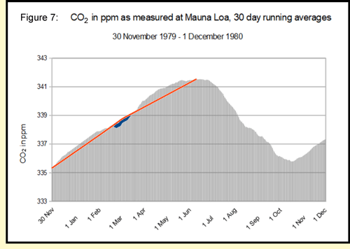
X1980 lies closest to the mean of 0.38 of all years analyzed except 2023, which fails the robustness test. This means that the minimum distance between the averages of any two consecutive non-overlapping 30-day periods within the window of interest is closest to the average over all years analyzed. While there is a very slight depression in late February, it is much too short to bring X1980 down even close to the negative range. Atmospheric CO2 concentrations reached a 30-day maximum of 341.54 ppm on 10 June. 
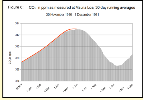
X1981 exhibits the maximum value over all years analyzed. The average atmospheric CO2 concentration for the 30-days ending on 5 Feb. is 0.92 ppm more than the average for the 30-days ending on 6 Jan. The graph fails to show a noticeable depression within the window of interest, and indeed, it appears to be close to a straight line within this window Atmospheric CO2 concentrations reached a 30-day maximum of 343.04 ppm on 30 May. 
Discussion and Conclusion Analysis of NOAA's ESRL data on atmospheric CO2 concentrations at Mauna Loa shows that during exactly three years out of the last 49 (as far back as the record goes), 30-day concentrations fell from one 30-day average to the next non-overlapping 30-day average during the December through March window of interest. Where did all this CO2 go? Elemental carbon is not known to just disappear (except isotope 14C which appears in nature at very low concentrations). Nor is it likely to have escaped into outer space in appreciable quantities. It could possibly have shifted to other locations in the atmosphere or the data published by ESRL might have been erroneous; but the author would suggest that the most likely possibility is that it ended up in carbon sinks such as our oceans and forests. Then there is the question of where did all the CO2 added to the atmosphere a month later come from? Again, there are many possibilities. However, only two seem at all likely: Anthropogenic CO2 emissions might have added this extra carbon back into our atmosphere.These two possibilities are not mutually exclusive. They could both be at play at the same time. Then there is the fact that these three years happen to coincide with what might be the three greatest global socio-economic disruptions of the last half century. Of course, the two sets of events might not be related; yet, this would constitute a very unlikely statistical anomaly. Scientists assure us that reductions in anthropogenic CO2 emissions, such as those that might be caused by socio-economic disruptions could not possibly result in short-term reductions in atmospheric CO2 concentrations. But scientists have been known to be wrong before. And perhaps, there are other pathways by which socio-economic disruptions may lead to reductions in atmospheric CO2 concentrations. According to this Graph from Statista, neither 2008 nor 2022 witnessed a reduction in anthropogenic CO2 emissions, although there was a large downturn in CO2 emissions in both 2020, the year of the COVID-19 outbreak, and 2009, as the global economy began to recover from the 2008 meltdown. Further, there may be a set of events that I am not aware of that happened only during these three years, that is responsible for the observed decrease in atmospheric CO2 concentrations. Or there may be other great global socio-economic disruptions that I am not aware of that occurred in other years. (The breakup of the Soviet Union is a possibility, but likely, its disruptive effects were more regional than global.) So many unknowns! So much to think about. The physical and chemical mechanisms by which these temporary decreases in atmospheric CO2 concentrations occurred coincident to global socio-economic disruptions would be interesting to know; but more importantly, they could lead to workable strategies for increasing the flow of carbon from the atmosphere into carbon sinks, thereby reducing the warming of planet Earth. This could be crucial for human life on Earth. However, I will leave this research to folks more knowledgeable than I am. Links: WMO CO2 X2019 Scale ESRL file of daily CO2 averages at Mauna Loa ESRL article, “Can we see a change in the CO2 record because of COVID-19?” Table of statistics “Annual carbon dioxide (CO2) emissions worldwide from 1940 to 2022,” —Statista “Some Indications That COVID-19 May Have Affected Atmospheric CO2 Concentrations in February and March, 2020” (written in the Spring of 2020 by Tom Sager). This article Spreadsheet with calculations for this article. |